Problem:
When approaching us, the Brand Building, PR, and Logistics company faced several challenges in establishing a robust presence in a crowded market. Despite their commendable services and dedication to client satisfaction, their visual representation failed to communicate their core values, mission, and unique selling points. In an industry where first impressions matter immensely, this was a glaring hurdle. Their existing branding was generic and didn’t capture the multifaceted nature of their services. They needed a brand identity that would not only resonate with their target audience but also reflect the professionalism, creativity, and innovative spirit of the brand. Specifically, they envisioned a simple yet impactful abstract letter logo that could encapsulate the brand’s essence in a glance.
Solution:
After a comprehensive research phase, I crafted an intertwined abstract letter logo, a testament to their ethos of unity, connectivity, and growth. The chosen color palette and typography mirrored the brand’s trustworthiness and innovative spirit. This design, though simple, encapsulated their unique approach to building standout brands, fusing both their simplicity and distinctiveness in one cohesive visual identity.

Sketching & Ideation: Armed with my research, I moved to the drawing board. Jotting down ideas, I experimented with various letter combinations, flirted with abstract symbols, and envisioned designs that could depict the brand’s multifaceted offerings.

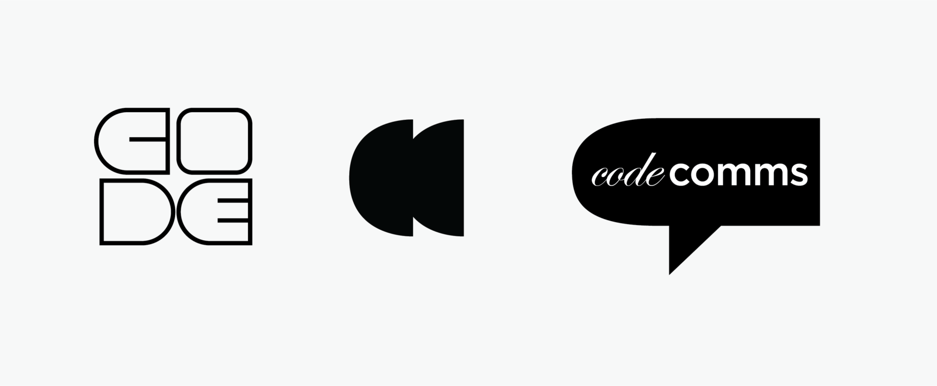
Harmony of Simplicity and Impact: Adhering to their brief for a minimal yet captivating logo, I developed a design where the abstract letters were intertwined. This not only represented the brand’s initials but also symbolized unity, connectivity, and upward growt
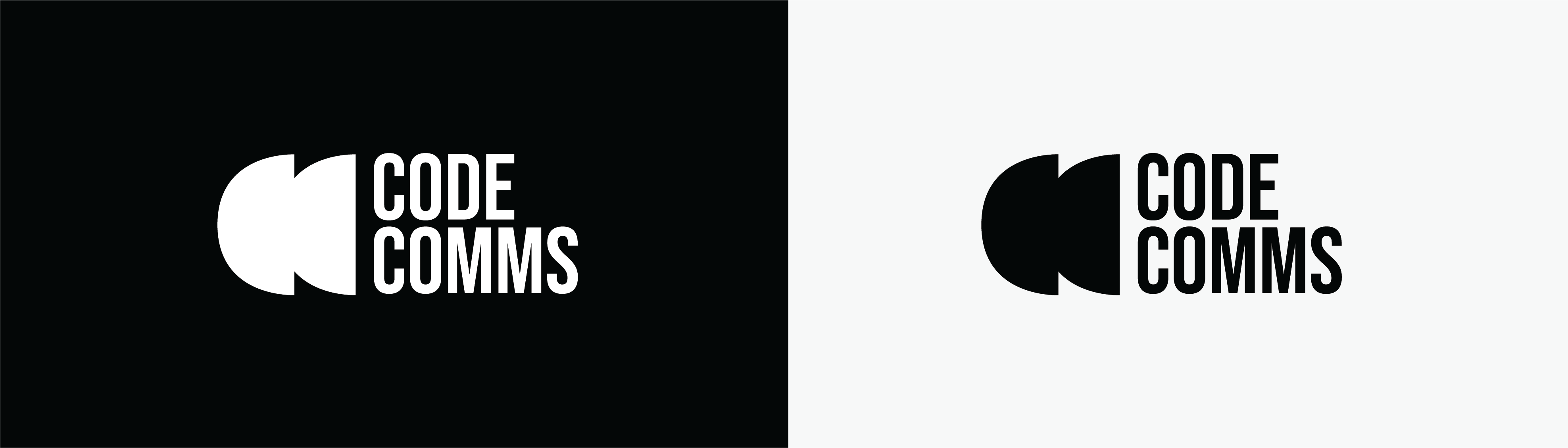

Palette & Typography Selection: My choice of color palette aimed to be contemporary, evoking feelings of trust, reliability, and forward-thinking. For typography, I chose a font that effortlessly complemented the abstract logo – ensuring readability and adding a dash of modern flair.


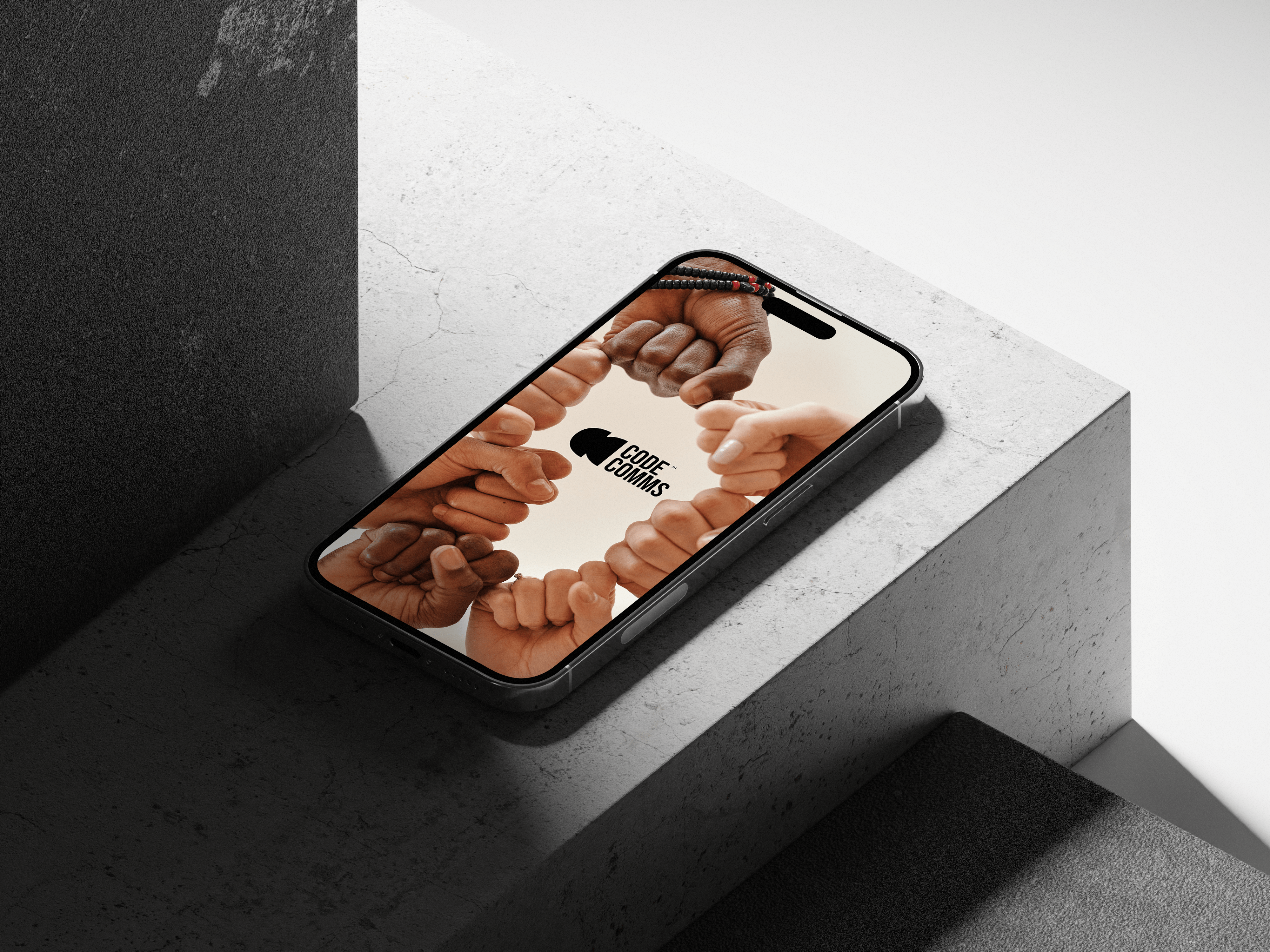
Expanding the Brand Identity: With the logo set, I embarked on creating a cohesive brand identity package. This extended from business cards and letterheads to digital assets, ensuring that the brand’s new face was consistently impressive across all touchpoints.