Impact Farm Ltd
Year
2017
Roles
Brand Strategy, Brand Identity Design, Web Design, Social Media Content Creation.
Deliverables
- Branding Identity Design
- Web Design
- Social Media Posts
- Collateral Design
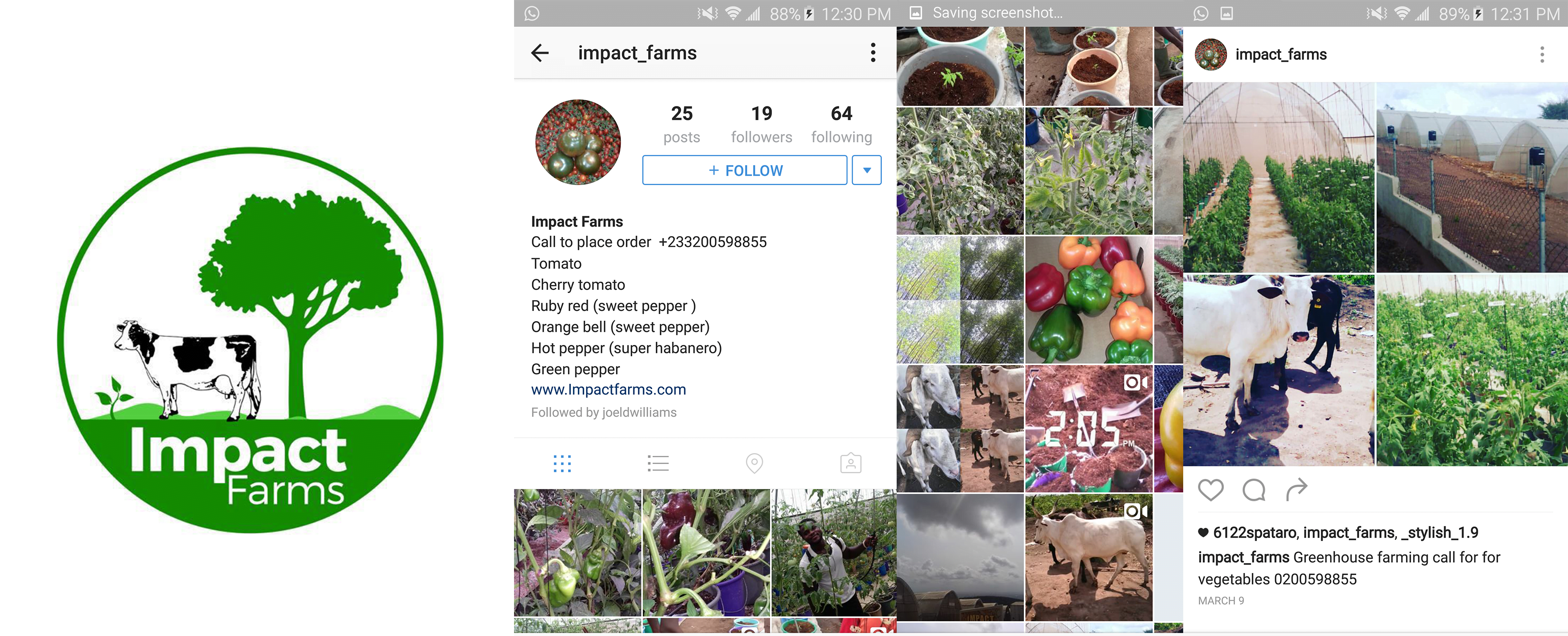
The Problem
Impact farms produces your best fresh veggies in the best of conditions for large markets, restaurants and the everyday mum that wants the best for their families. They approached me with a rather botched identity that needed a revamp. They had three things in mind, revamping their outlook, social media and simple website to go along with.
The Solution
The solution was to driven out simple ideas, using appetizing imagery and vibrant coloring to rebirth a new brand that stands out, retains customer attention and create the desire in the eyes of their customers.

Defining the Problem, Crafting Solutions
Impact Farms needed a brand refresh that completed renovated their brand promise and assures its customers of the best, as well as bring a concentration to their core value proposition – which their focus on growing organic vegetables.
Their brand message was muffled, making it hard to cut through the noise and reach their desired audience. Their online presence was underwhelming and off-brand, further muddying their identity and making it difficult for potential buyers to perceive the high quality of their products. As a brand designer, I was brought on board to help Impact Farms understand the urgency and importance of a well-executed rebrand.
Developing the Brand Identity
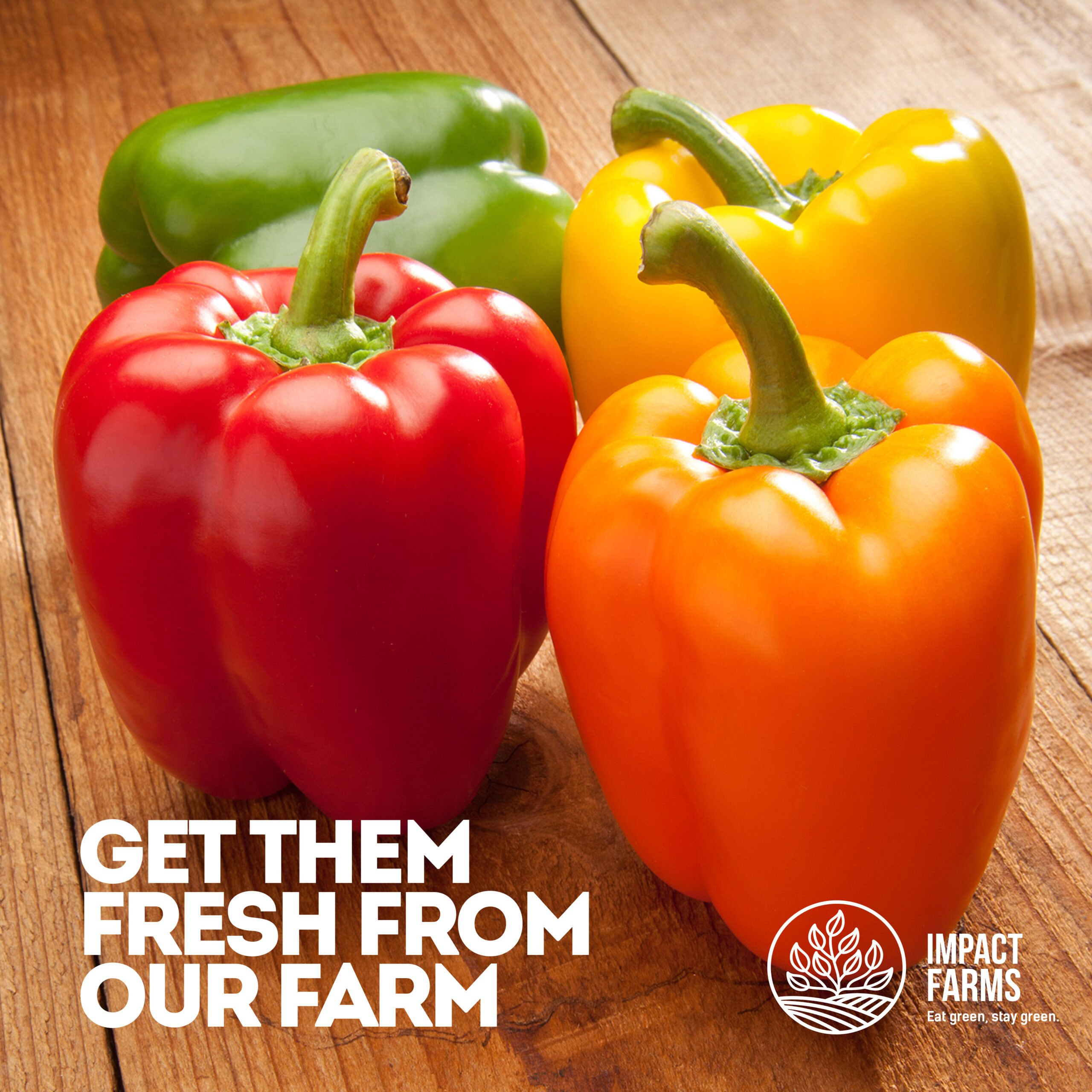
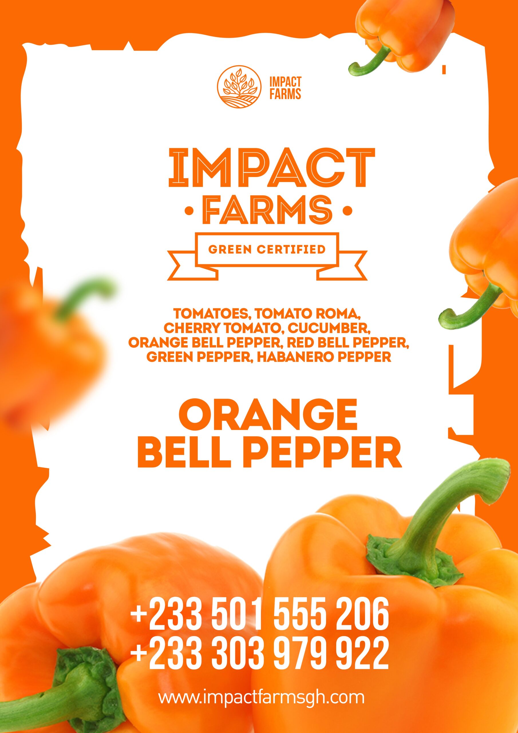
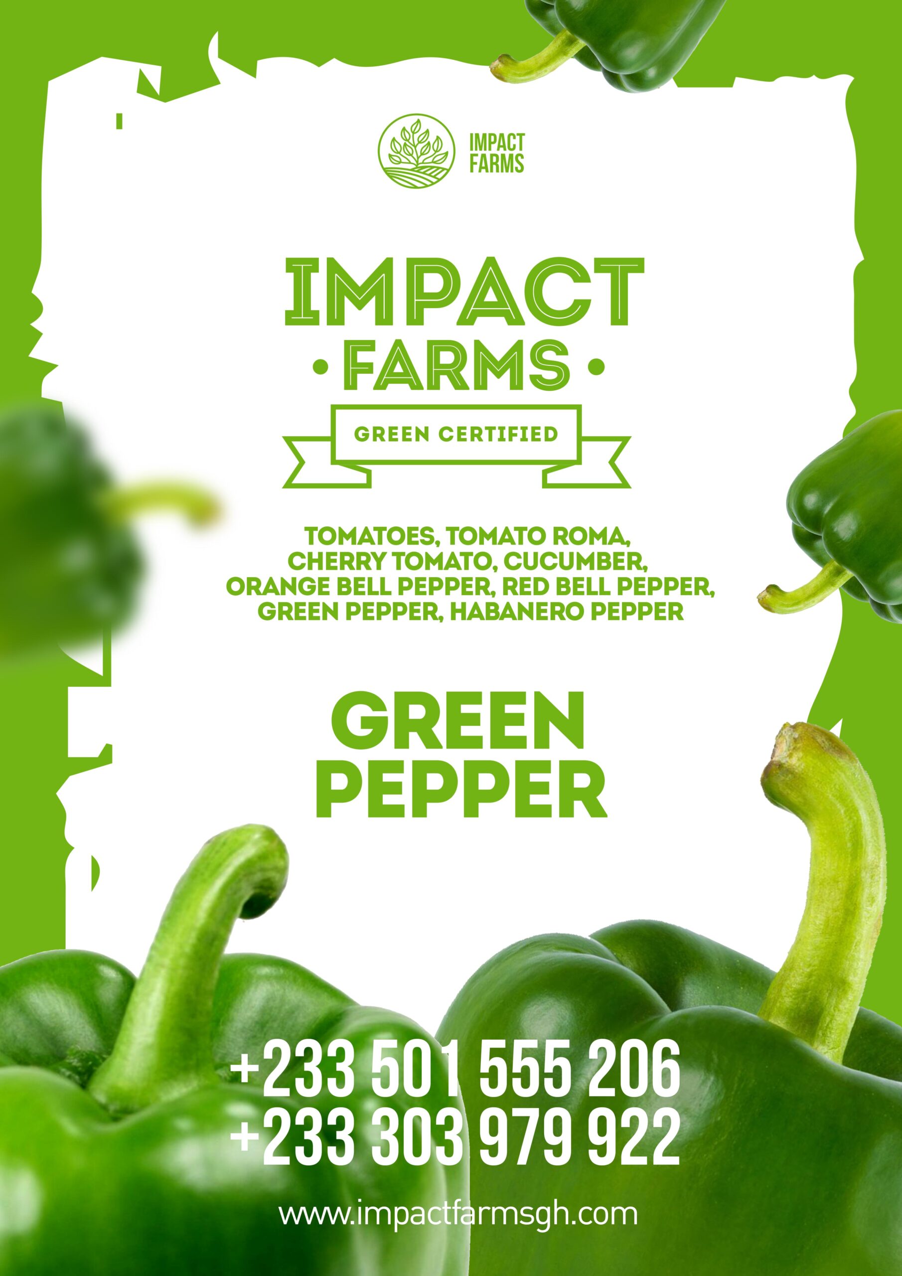
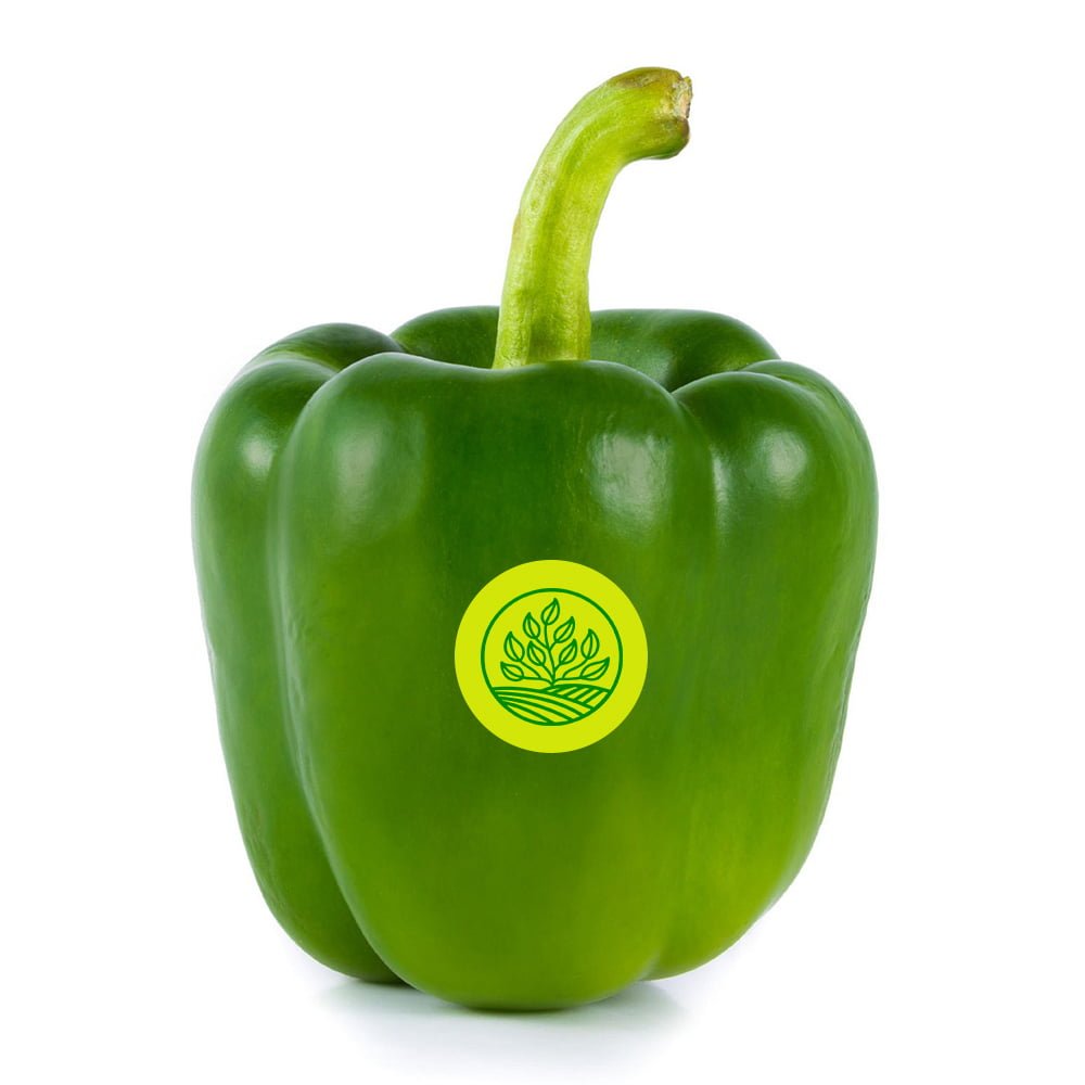
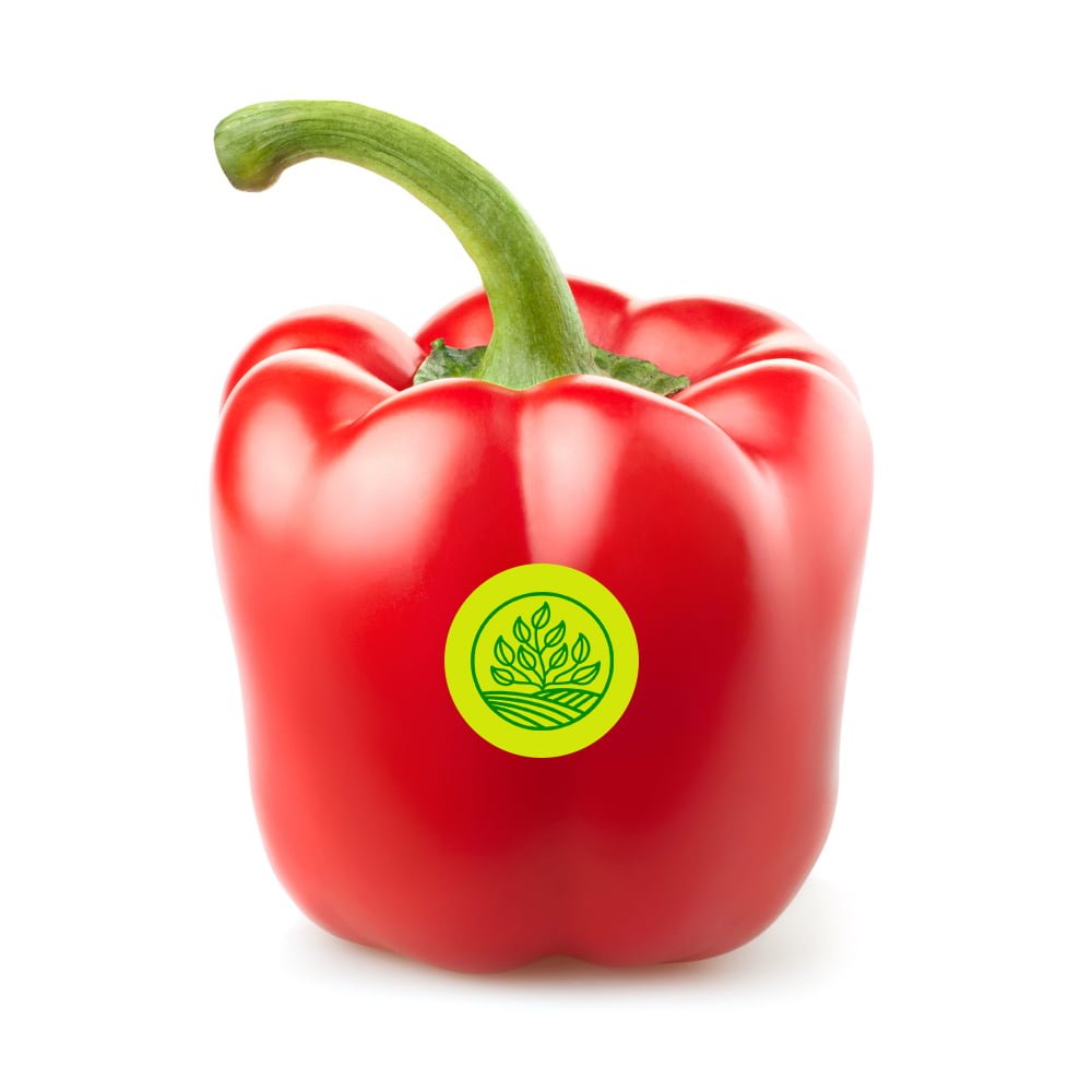
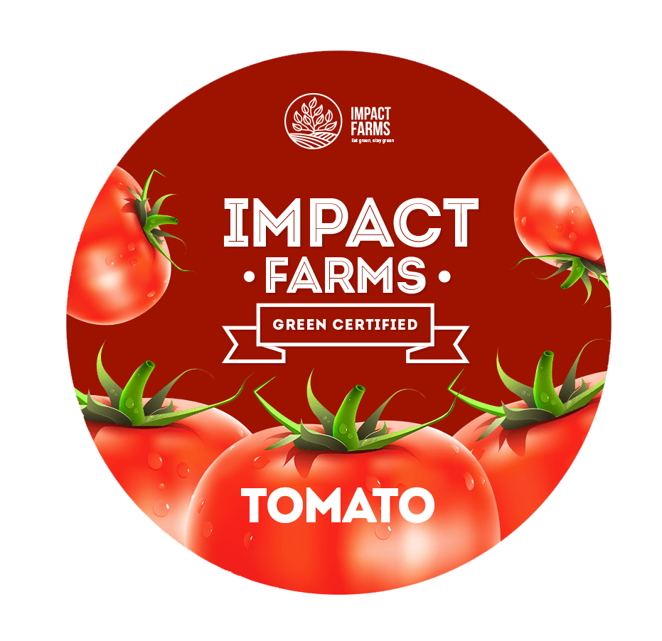
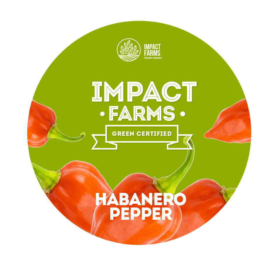
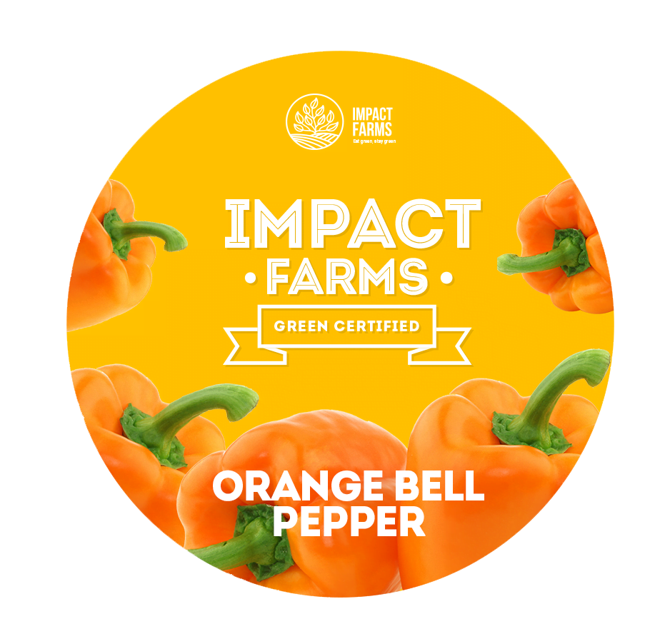
Impact Farms is committed to producing bell peppers of the highest quality, and this was the essence we needed to capture. I led a comprehensive ideation process, brainstorming various concepts and refining them down to a simple, yet powerful identity. This new identity encapsulated their commitment to quality, their attention to detail, and their dedication to providing the best bell peppers in the market.
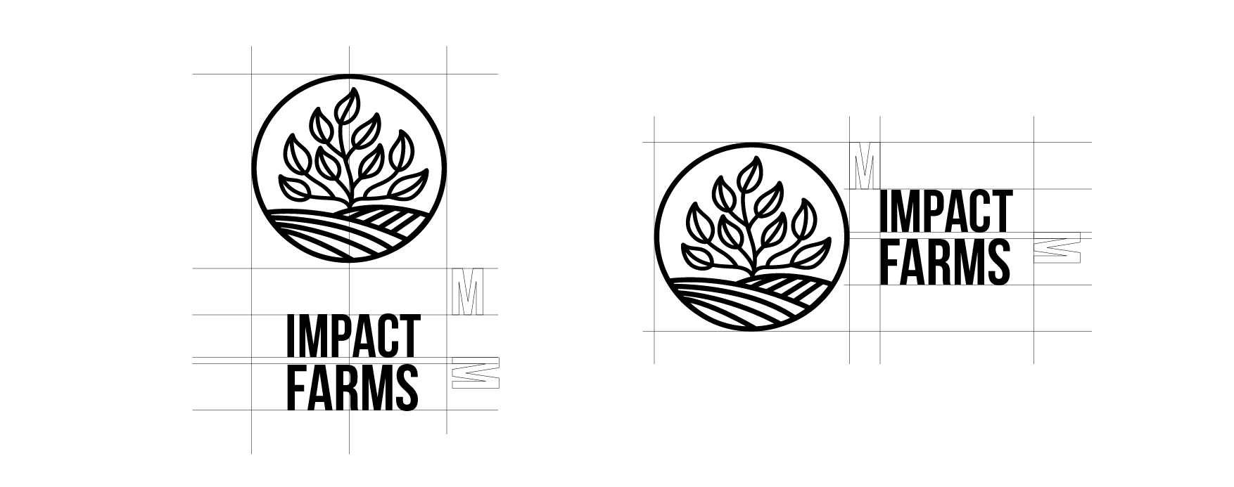
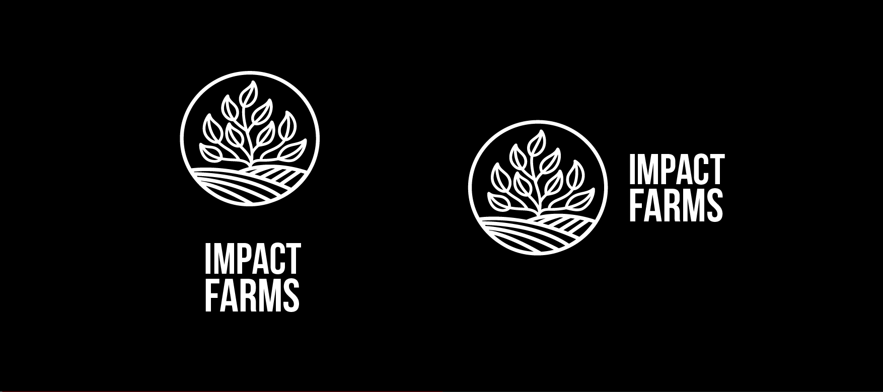
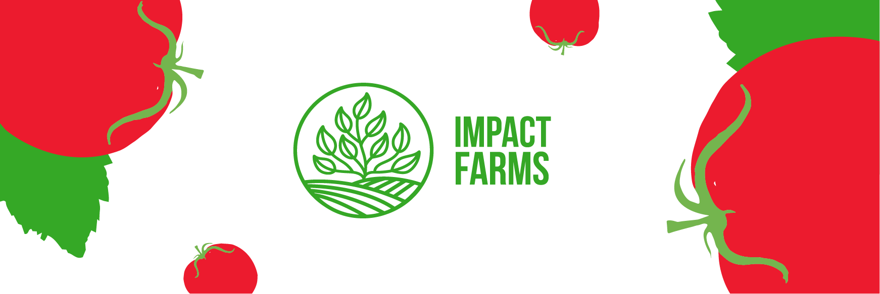
The Logo
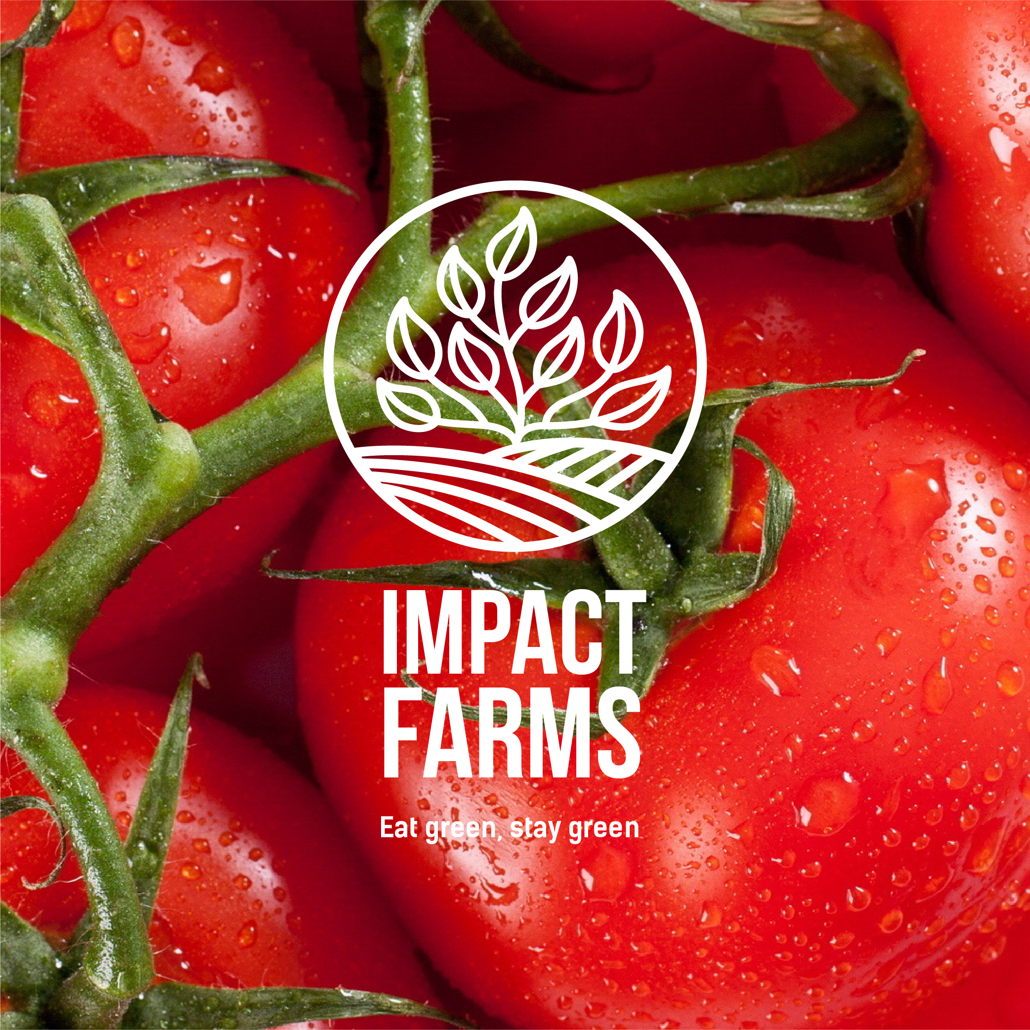
To visually represent Impact Farms’ new identity, I designed an abstract vector illustration. This dynamic logo was conceived from the vision of plants growing on fertile grounds, symbolizing the brand’s commitment to nurturing high-quality produce. The abstract nature of the logo not only appeals aesthetically, but it also allows for a broad interpretation, inviting the viewer to think about growth, quality, and nature’s bounty – key elements of Impact Farms’ identity.

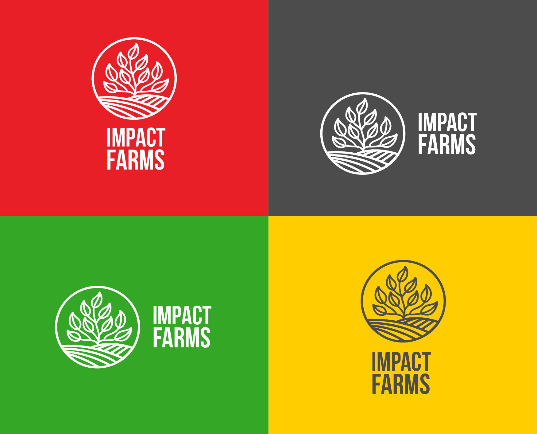
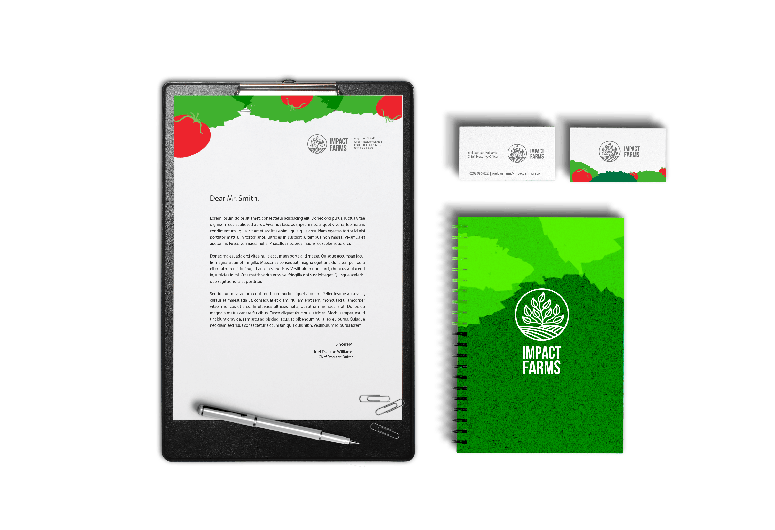
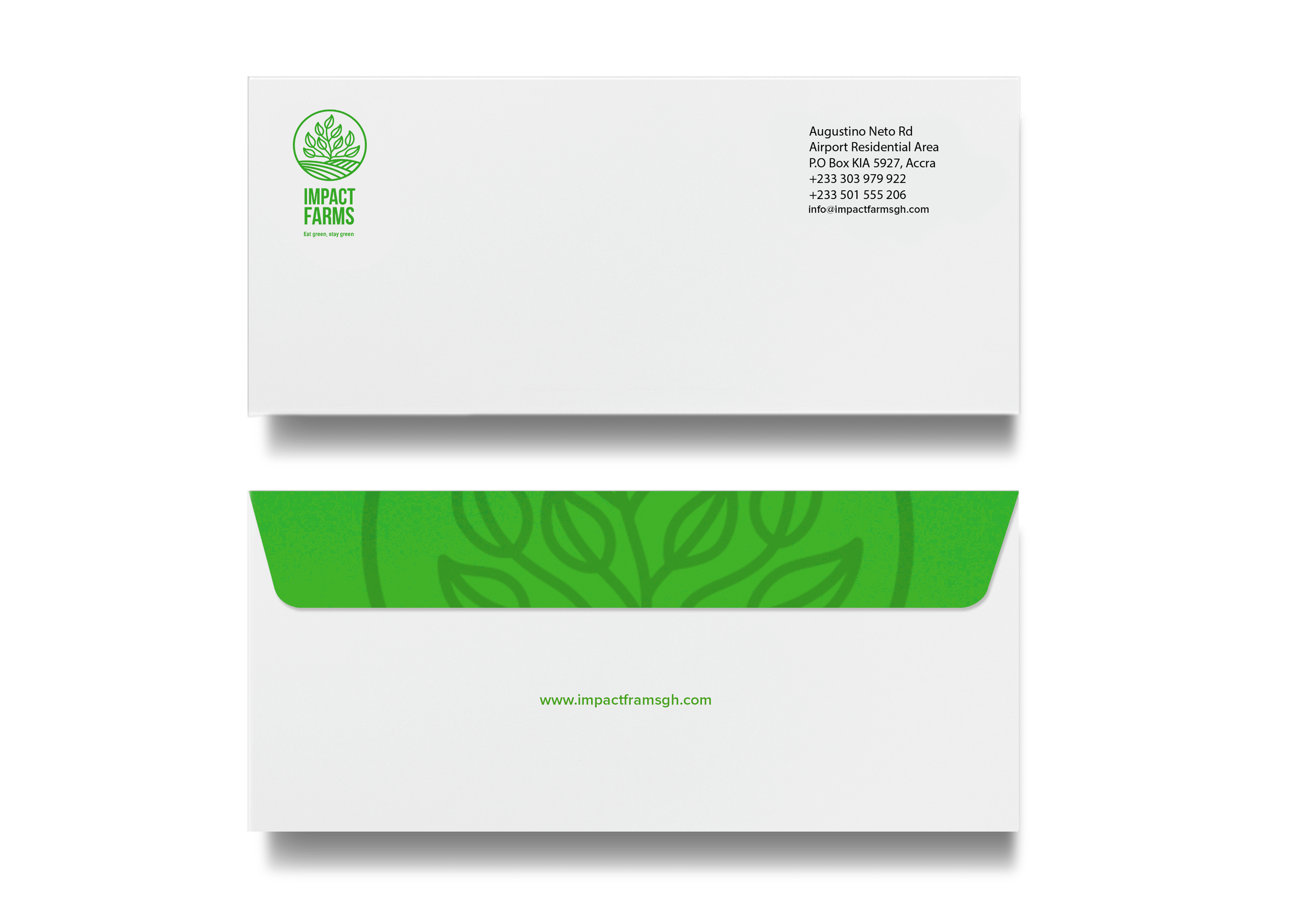
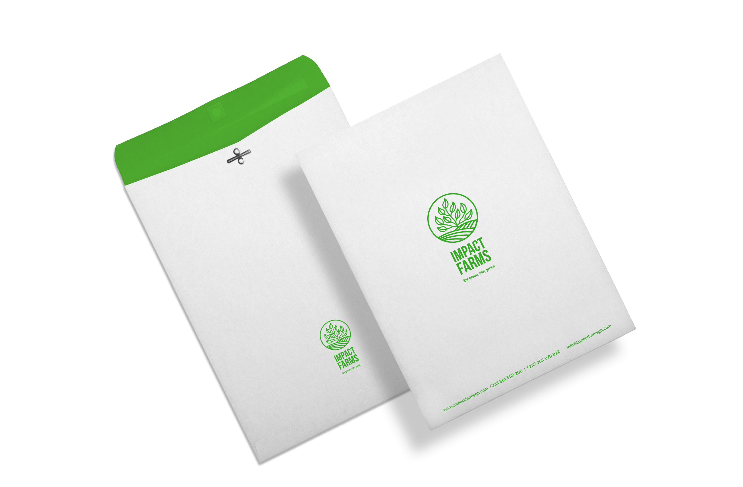
The Brand Elements
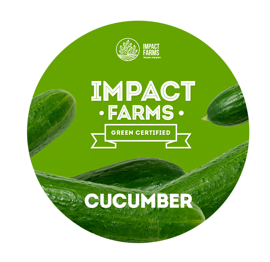
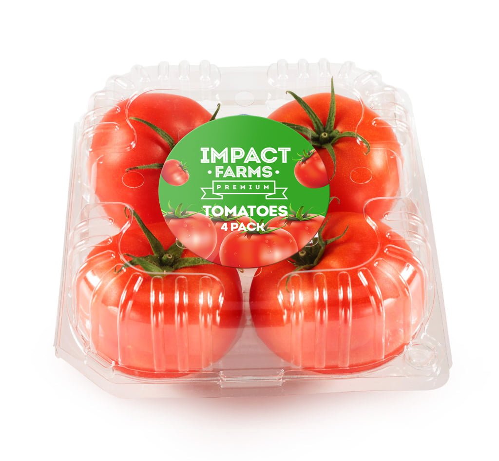
Beyond the logo, a brand extends into a carefully curated palette of colors, typography, and imagery, creating a cohesive look and feel. I chose earthy colors to mirror the natural process of farming and paired them with clean, modern typography to reflect the brand’s commitment to innovation.
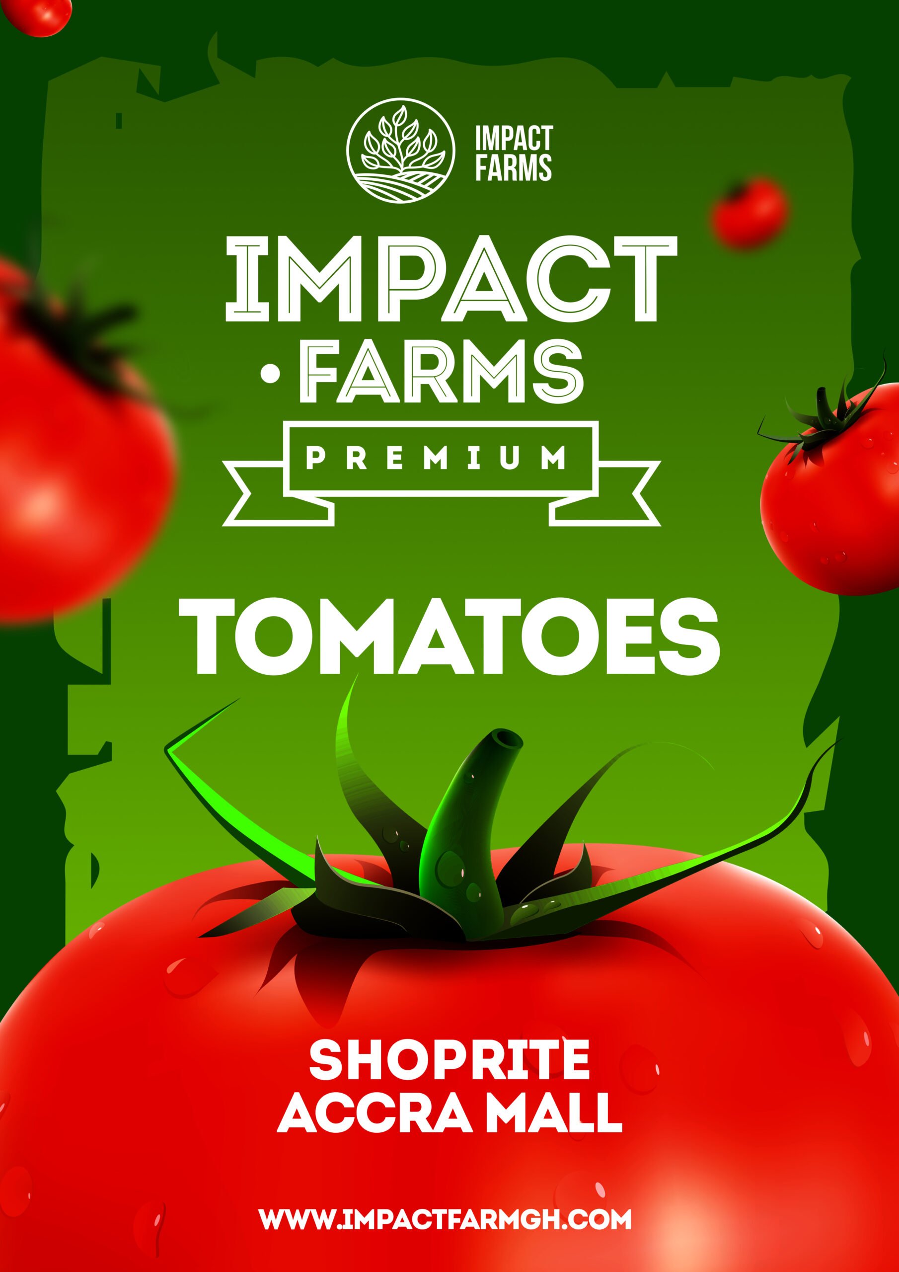
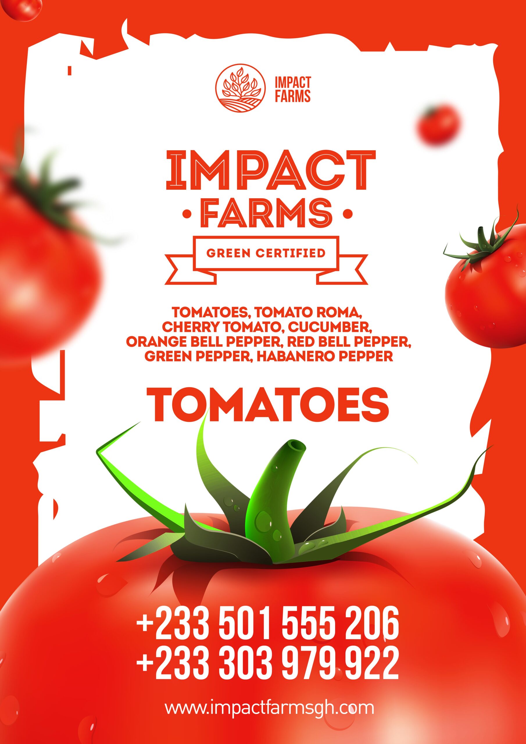
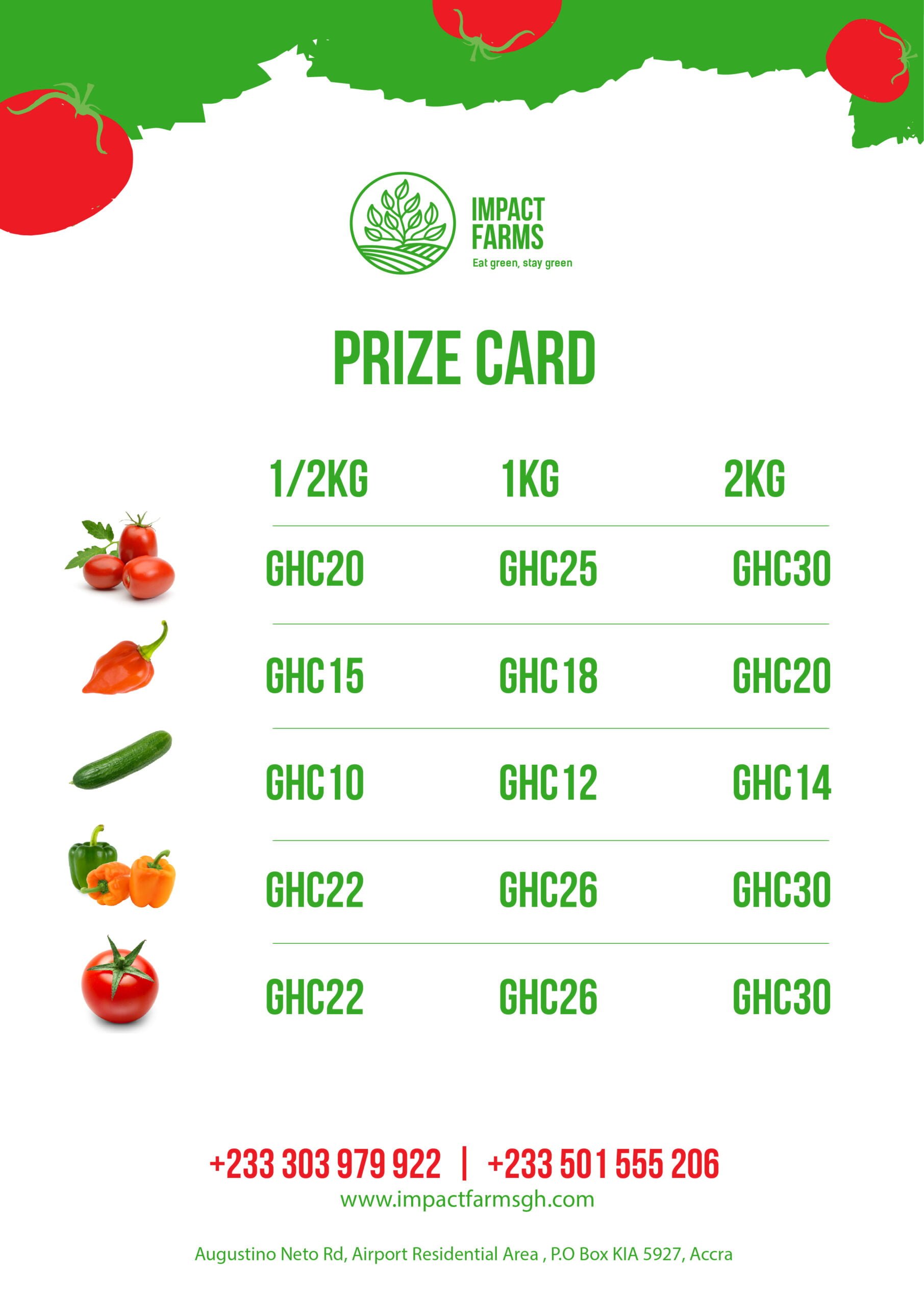
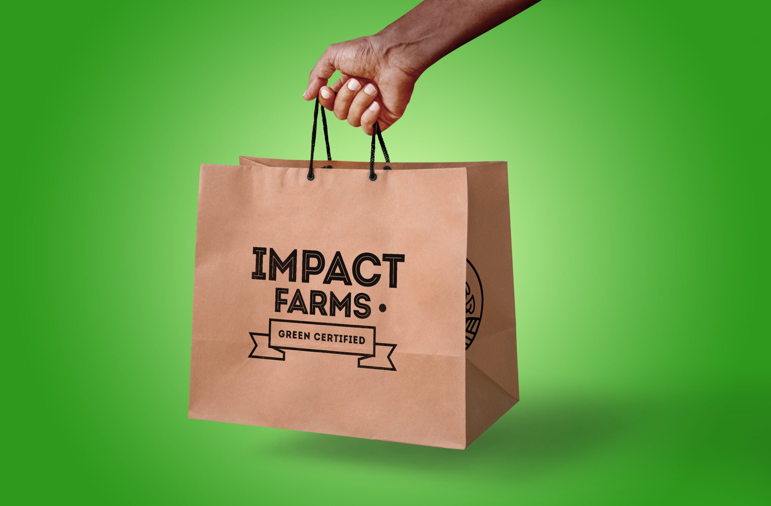
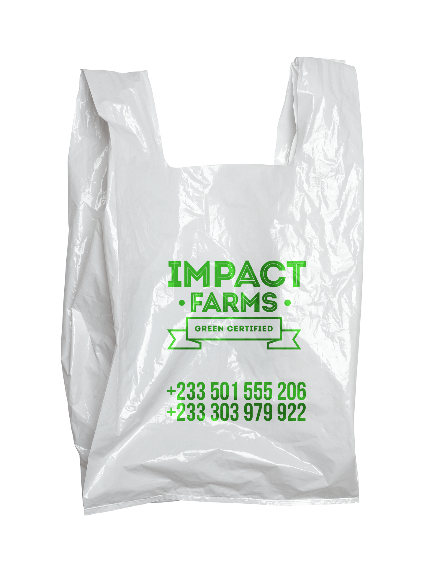
Additionally, the brand’s imagery centers around high-resolution photos of vibrant bell peppers, reinforcing the quality of their produce. All these elements were then translated into various collateral designs such as business cards, stationery, and packaging, ensuring a consistent visual identity across all physical touchpoints.
Communication
Material

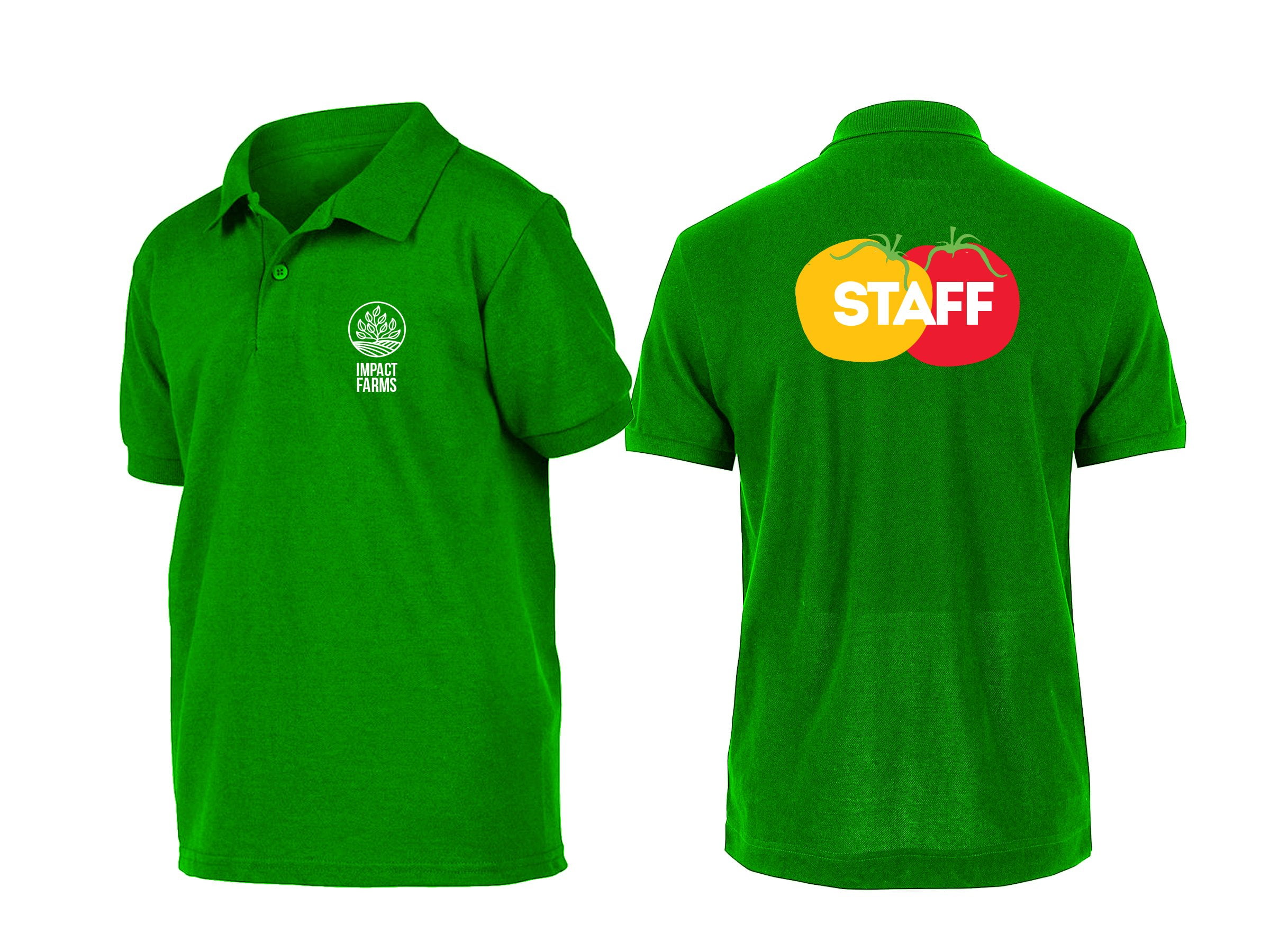
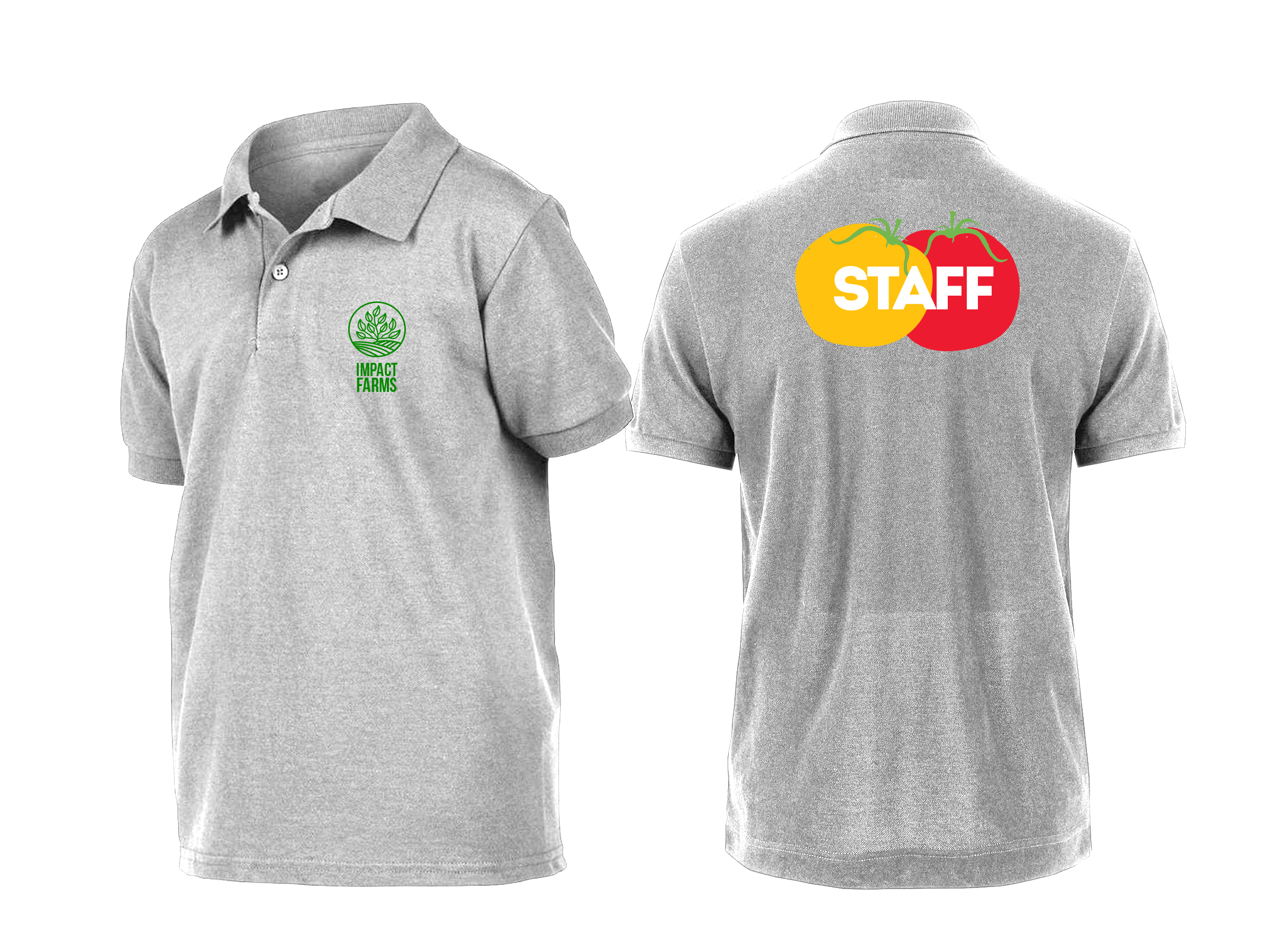
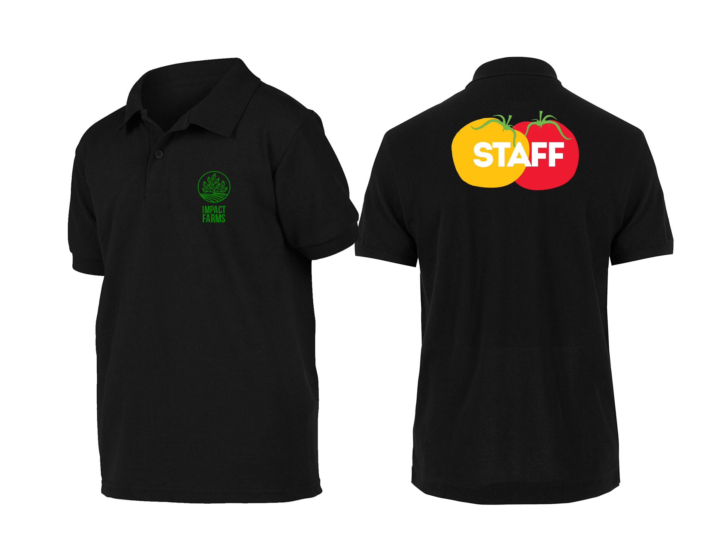
Work Gear
Packaging


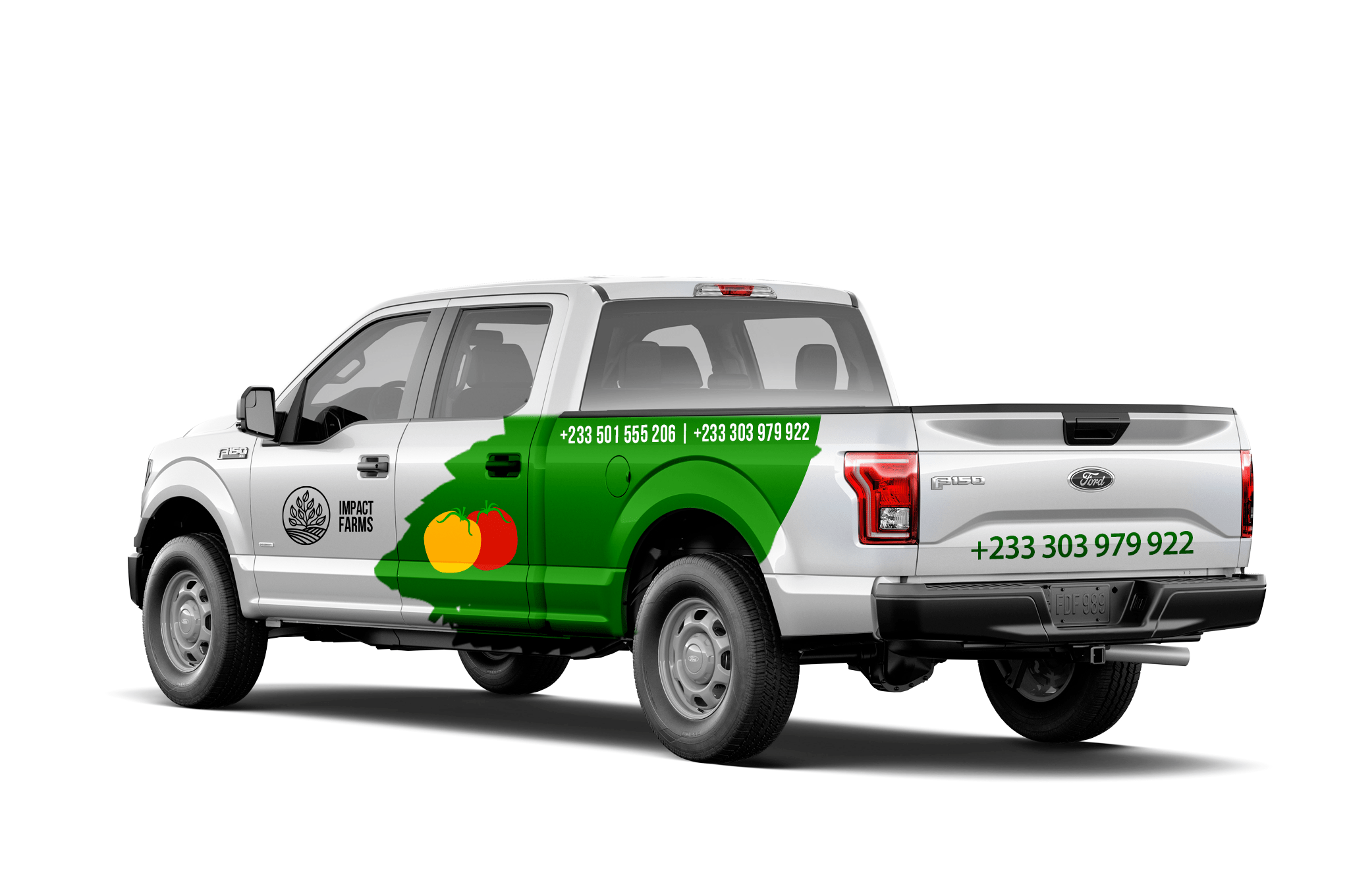
Vehicle Branding


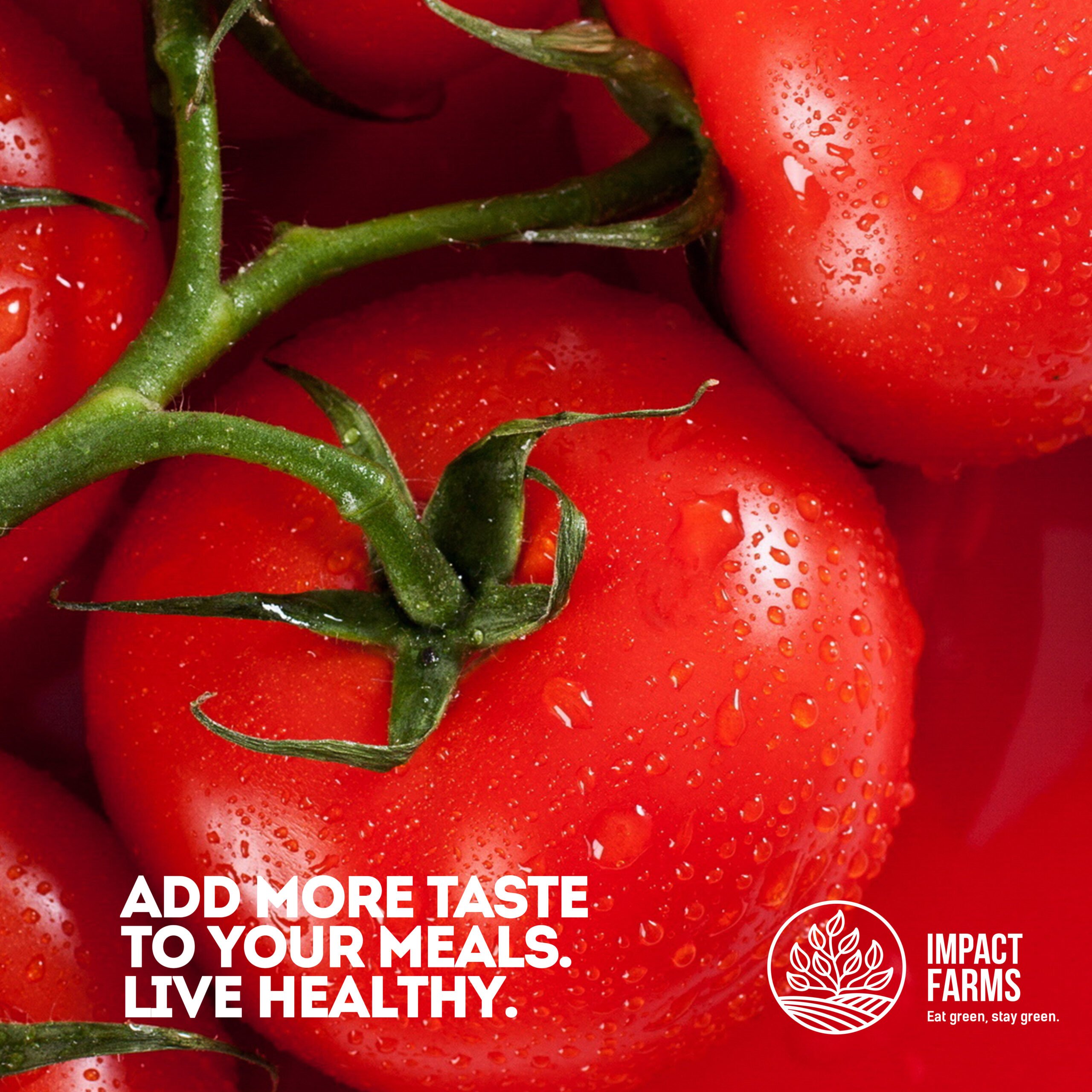
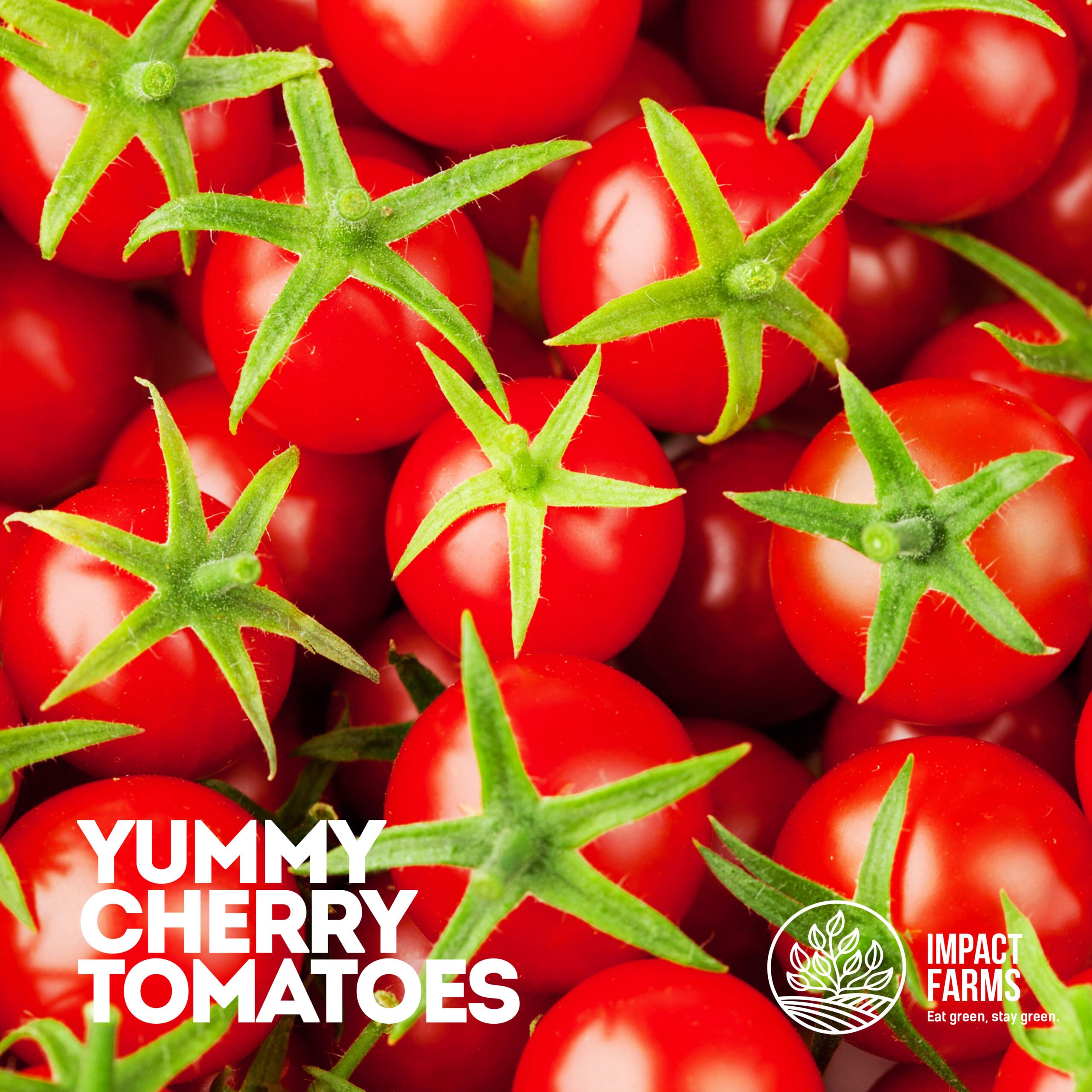
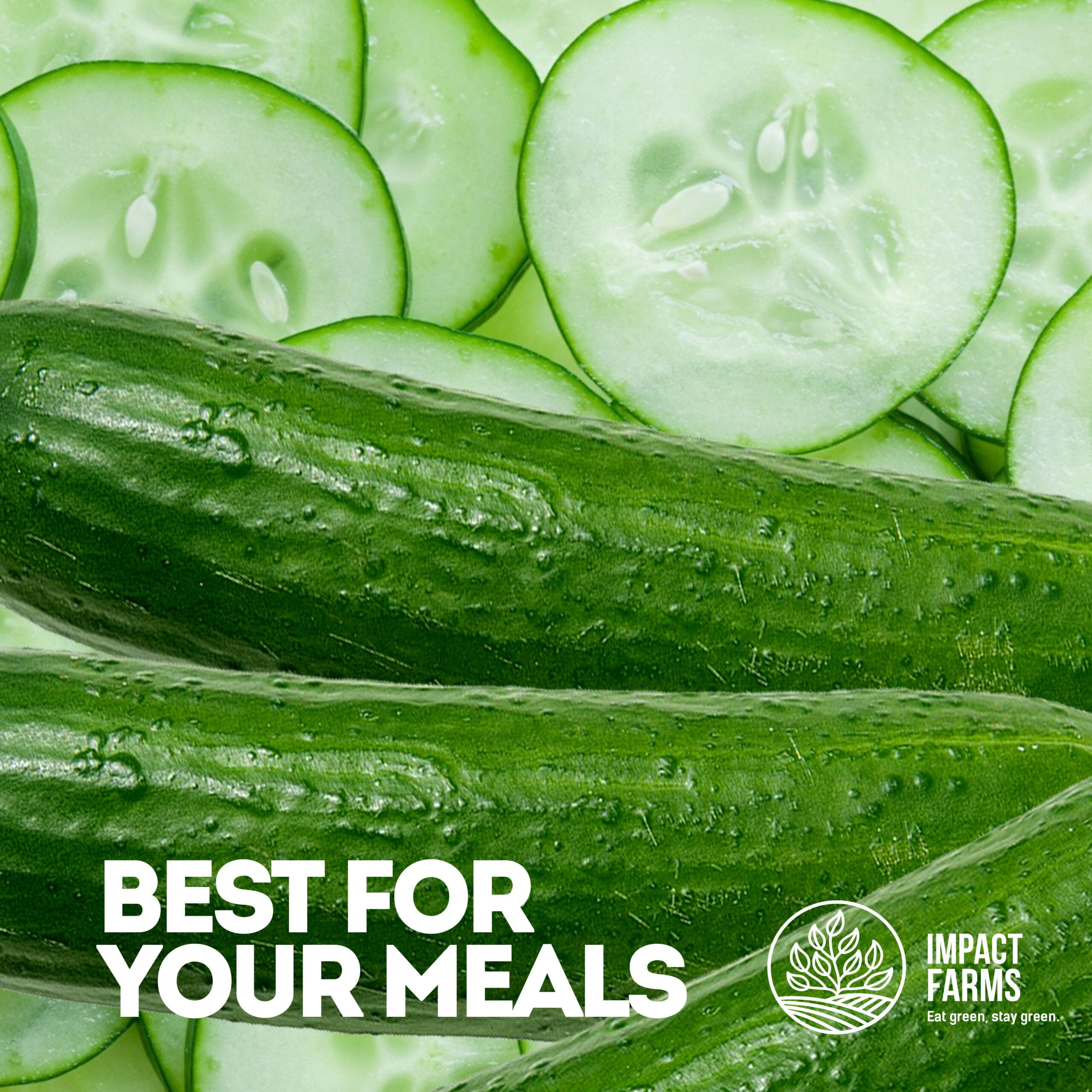
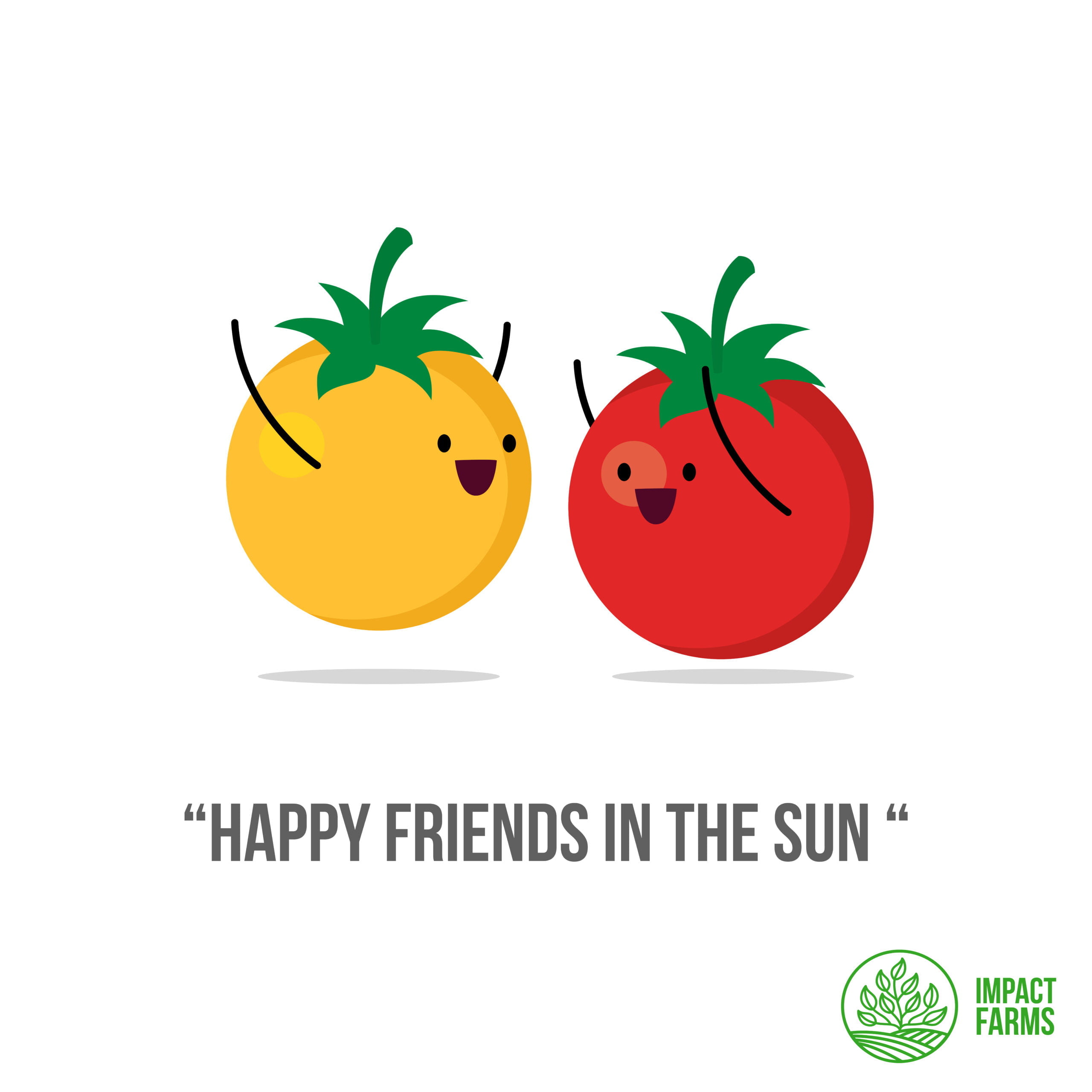
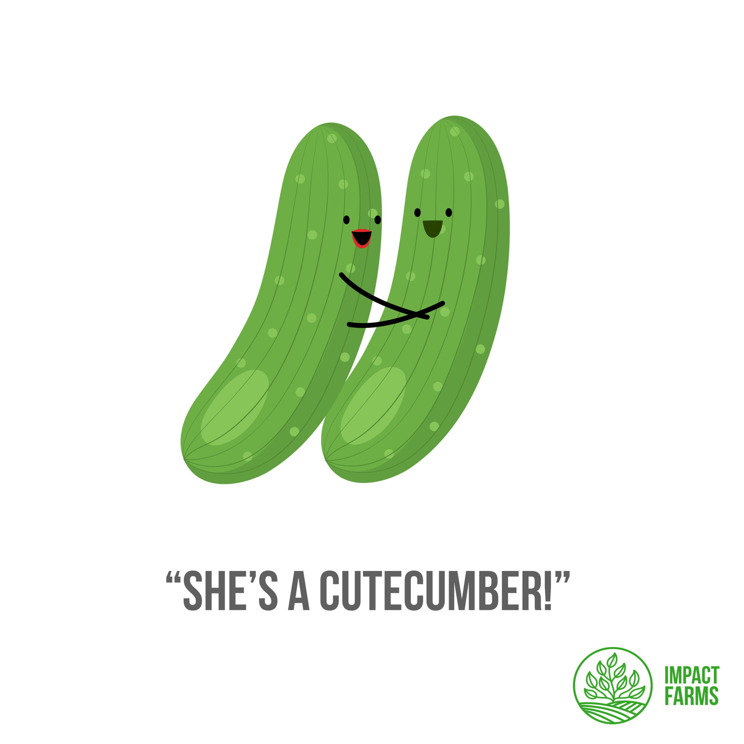
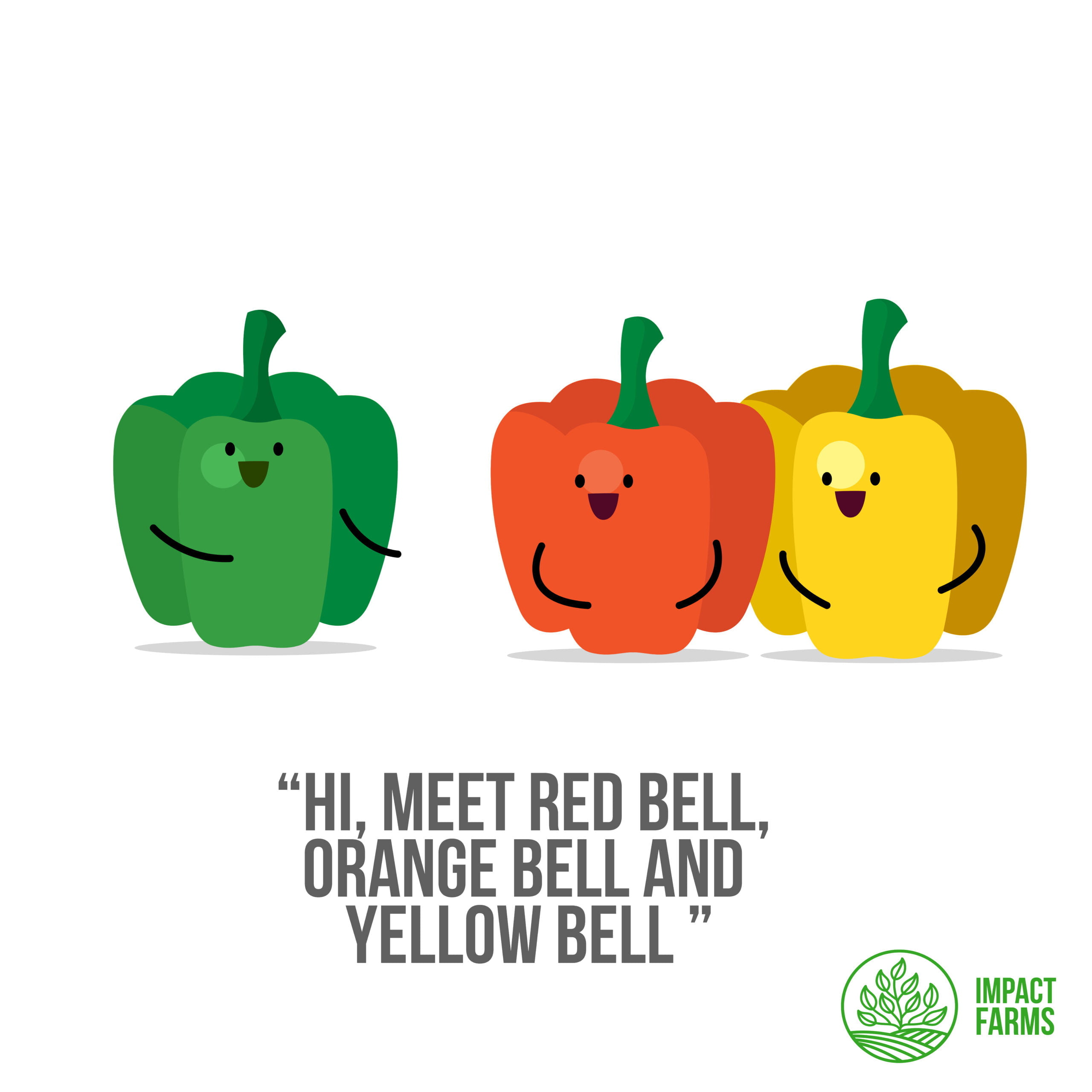
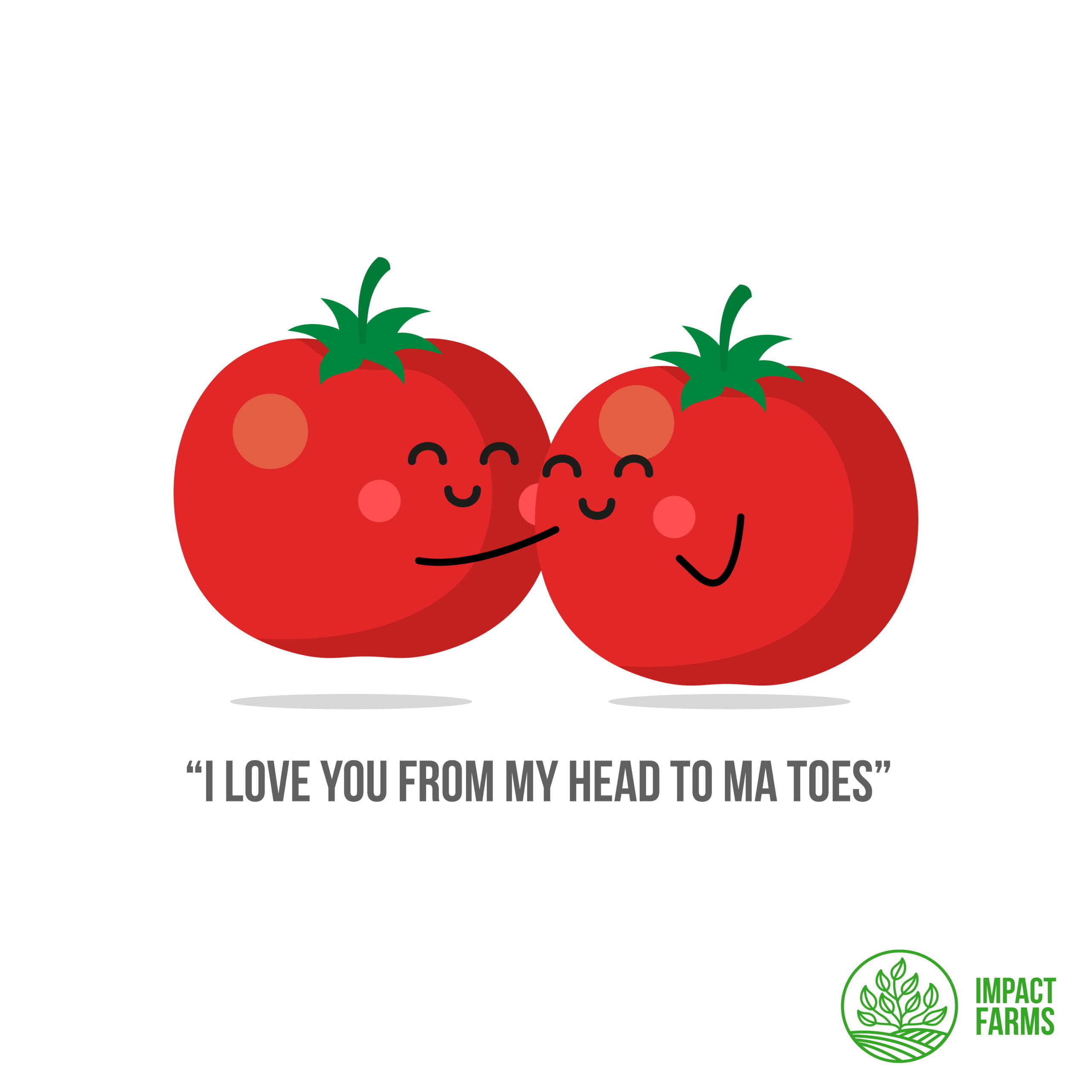
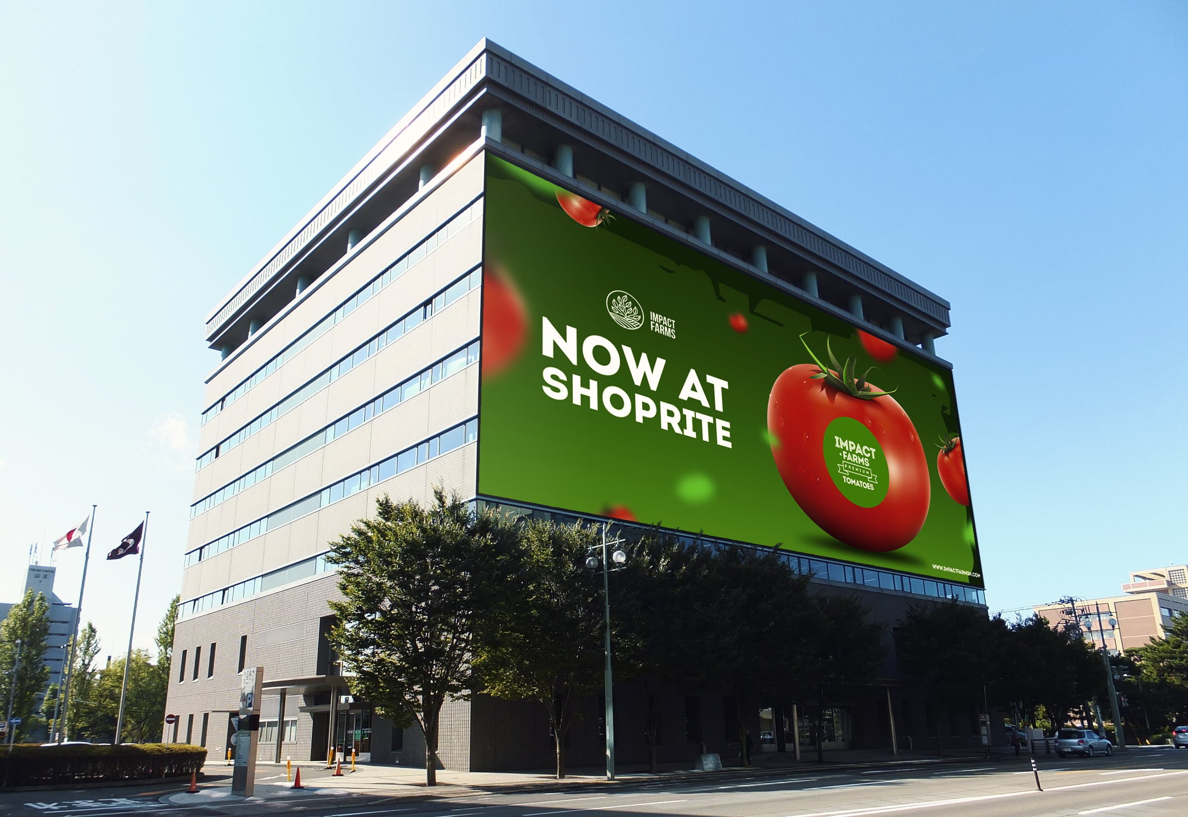
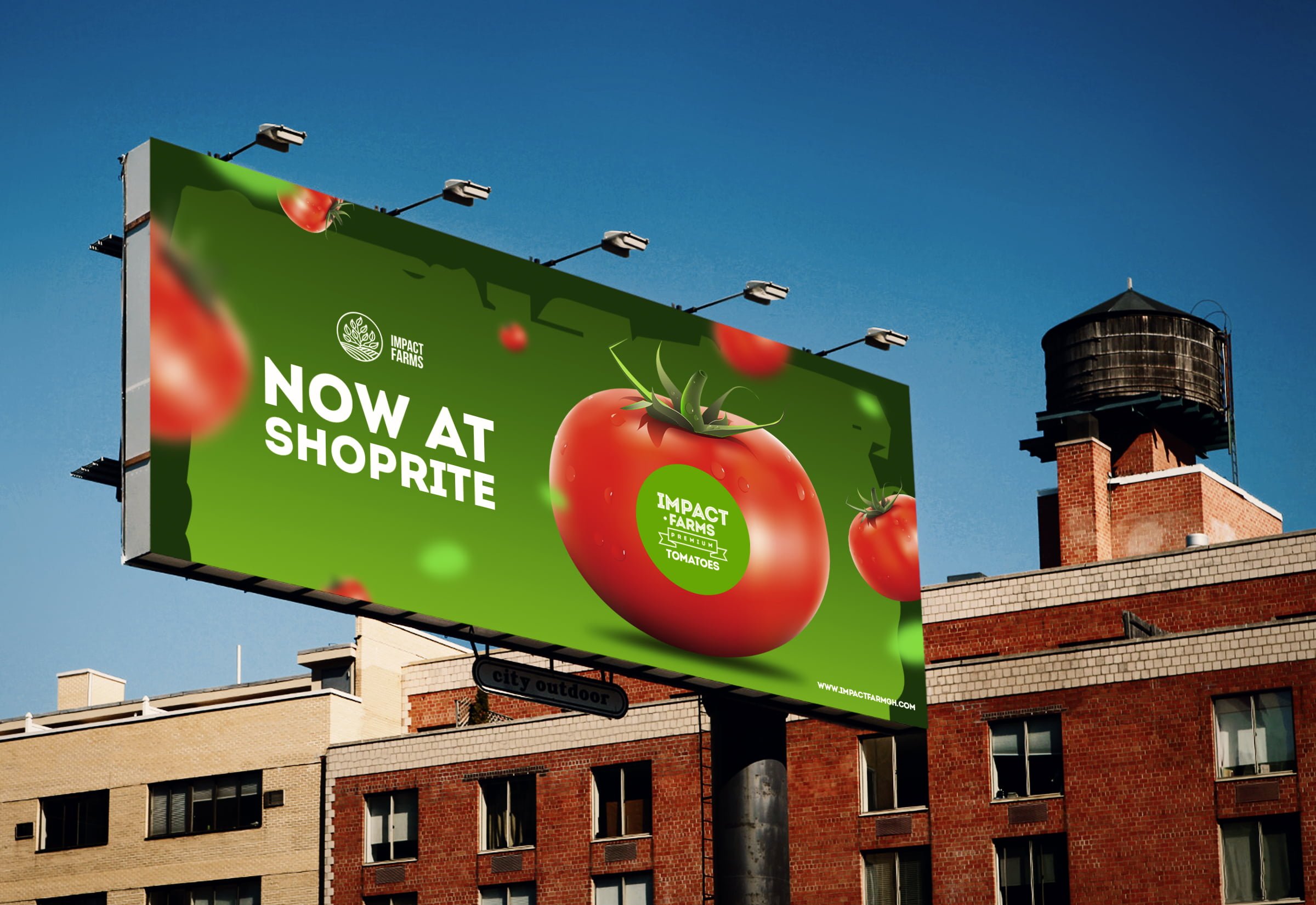
Social Media
A brand’s website is its digital storefront, an extension of its identity in the virtual world. For Impact Farms, we wanted the website to be more than just a sales platform; it was to be a testament to their brand ethos. I worked closely with the web development team to create a website that was user-friendly, visually engaging, and truly reflective of the new brand identity. High-quality product images, engaging content, and the consistent application of the new visual identity came together to create a website that was as informative as it was attractive.